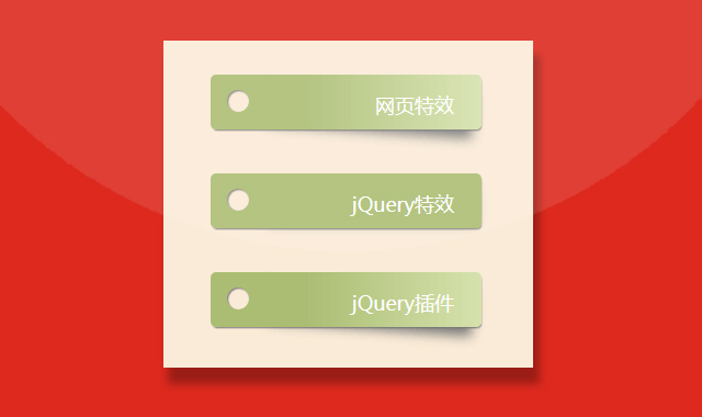


这是一款CSS3悬停带阴影贴纸标签文字特效代码。
使用方法
在页面引入以下CSS样式
<style>
html {
  box-sizing: border-box;
  font: 18px PT Mono;
  background: antiquewhite;
}

*,
*::before,
*::after {
  box-sizing: inherit;
}

body {
  display: flex;
  align-items: center;
  justify-content: center;
  flex-direction: column;
  height: 100vh;
}

.box {
  width: 15%;
  min-width: 150px;
  display: block;
  height: 50px;
  position: relative;
  border-radius: 5px;
  background: linear-gradient(to right, #abbd73 35%, #d6e2ad 100%);
  margin-bottom: 40px;
  padding: 15px 25px 0 40px;
  color: darkslategray;
  box-shadow: 1px 2px 1px -1px #777;
  transition: background 200ms ease-in-out;
  text-align:right;
}

.box a{color:#fff;text-decoration:none;}

.shadow {
  position: relative;
}
.shadow:before {
  z-index: -1;
  position: absolute;
  content: "";
  bottom: 13px;
  right: 7px;
  width: 75%;
  top: 0;
  box-shadow: 0 15px 10px #777;
  -webkit-transform: rotate(4deg);
          transform: rotate(4deg);
  transition: all 150ms ease-in-out;
}

.box:hover {
  background: linear-gradient(to right, #abbd73 0%, #abbd73 100%);
}

.shadow:hover::before {
  -webkit-transform: rotate(0deg);
          transform: rotate(0deg);
  bottom: 20px;
  z-index: -10;
}

.circle {
  position: absolute;
  top: 14px;
  left: 15px;
  border-radius: 50%;
  box-shadow: inset 1px 1px 1px 0px rgba(0, 0, 0, 0.5), inset 0 0 0 25px antiquewhite;
  width: 20px;
  height: 20px;
  display: inline-block;
  text-align:right;
  padding:0 20px 0 0;
}
</style>
Html结构
在页面引入以下html代码
<div class="box shadow">
    <a href="#">网页特效</a>
  <div class="circle"></div>
</div>
<div class="box shadow">
    <a href="#">jQuery特效</a>
  <div class="circle"></div>
</div>
<div class="box shadow">
    <a href="#">jQuery插件</a>
  <div class="circle"></div>
</div>