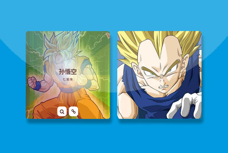


这是一款CSS3鼠标hover图片光芒四射动画特效。该特效中,当鼠标Hover图片的时候,通过对伪元素添加渐变和clip-path,来制作光芒四射的效果,非常炫酷。
HTML结构
该特效中图片和它的容器的基本HTML结构如下:
<div class="box">
    <img src="images/img-1.jpg">
    <div class="box-content">
        <div class="inner-content">
            <h3 class="title">孙悟空</h3>
            <span class="post">七龙珠</span>
        </div>
        <ul class="icon">
            <li><a href="#"><i class="fa fa-search"></i></a></li>
            <li><a href="#"><i class="fa fa-link"></i></a></li>
        </ul>
    </div>
</div>
CSS样式
然后为该CSS3鼠标hover图片光芒四射动画特效添加下面的CSS代码:
.box{
    border-radius: 10px;
    overflow: hidden;
    perspective: 800px;
    position: relative;
}

.box:before{
    content: "";
    width: 100%;
    height: 100%;
    background: linear-gradient(36deg, #272b66 42.34%, transparent 42.34%) 0 0,
    linear-gradient(72deg, #2d559f 75.48%, transparent 75.48%) 0 0,
    linear-gradient(-36deg, #9ac147 42.34%, transparent 42.34%) 100% 0,
    linear-gradient(-72deg, #639b47 75.48%, transparent 75.48%) 100% 0,
    linear-gradient(36deg, transparent 57.66%, #e1e23b 57.66%) 100% 100%,
    linear-gradient(72deg, transparent 24.52%, #f7941e 24.52%) 100% 100%,
    linear-gradient(-36deg, transparent 57.66%, #662a6c 57.66%) 0 100%,
    linear-gradient(-72deg, transparent 24.52%, #9a1d34 24.52%) 0 100%,
    #43a1cd linear-gradient(#ba3e2e, #ba3e2e) 50% 100%;
    background-repeat: no-repeat;
    background-size: 50% 50%;
    opacity: 0;
    position: absolute;
    top: 50%;
    left: 50%;
    -webkit-clip-path: polygon(50% 0%, 90% 20%, 100% 60%, 75% 100%, 25% 100%, 0% 60%, 10% 20%);
    clip-path: polygon(50% 0%, 90% 20%, 100% 60%, 75% 100%, 25% 100%, 0% 60%, 10% 20%);
    transform: translateX(-50%) translateY(-50%) scale(0) rotate(360deg);
    transition: all 0.3s ease 0s;
}

.box:hover:before{
    opacity: 0.5;
    transform: translateX(-50%) translateY(-50%) scale(1.5) rotate(0);
}

.box:after{
    content: "";
    width: 100%;
    height: 100%;
    background: radial-gradient(rgba(255,255,255,0.9),transparent,transparent);
    position: absolute;
    top: 0;
    left: 0;
    opacity: 0;
}

.box:hover:after{ opacity: 1; }

.box img{
    width: 100%;
    height: auto;
}

.box .box-content{
    width: 100%;
    height: 100%;
    text-align: center;
    position: absolute;
    top: 0;
    left: 0;
    z-index: 1;
}

.box .inner-content{
    width: 100%;
    color: #fff;
    position: absolute;
    top: 50%;
    left: 50%;
    opacity: 0;
    z-index: 2;
    transform: translate(-50%, -50%) scale(2);
    transition: all 0.3s ease 0.2s;
}

.box:hover .inner-content{
    opacity: 1;
    transform: translate(-50%, -50%) scale(1);
}

.box .title{
    font-size: 25px;
    font-weight: 600;
    color: #3e0e0c;
    text-transform: uppercase;
    margin: 0 0 5px 0;
    position: relative;
    transition: all 0.3s ease 0.2s;
}

.box .post{
    display: inline-block;
    font-size: 13px;
    font-weight: 600;
    color: #3e0e0c;
    text-transform: capitalize;
    letter-spacing: 2px;
}

.box .icon{
    width: 100%;
    padding: 0;
    margin: 0;
    list-style: none;
    position: absolute;
    bottom: -100%;
    left: 50%;
    transform: translateX(-50%);
    transition: all 0.3s ease 0.2s;
}

.box:hover .icon{ bottom: 15px; }

.box .icon li{
    display: inline-block;
    margin: 0 2px;
}

.box .icon li a{
    display: block;
    width: 40px;
    height: 40px;
    line-height: 40px;
    border-radius: 30%;
    background: #fff;
    font-size: 20px;
    color: #3e0e0c;
    transition: all 0.3s ease 0s;
}

.box .icon li a:hover{
    background: #3e0e0c;
    color: #fff;
}

@media only screen and (max-width:990px){
    .box{ margin-bottom: 30px; }
}