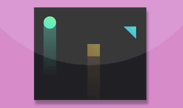


这是一款纯CSS3绘制几何图形缓缓上升,适用于网页背景动画特效。
使用方法
在页面引入以下CSS样式
<style>
body {
background: #202124;
}

@-webkit-keyframes circle {
0% {
  -webkit-transform: translateY(0);
          transform: translateY(0);
  opacity: 0;
}
50% {
  opacity: 1;
}
80% {
  -webkit-transform: translateY(-100vh);
          transform: translateY(-100vh);
  opacity: 1;
}
100% {
  opacity: 0;
  -webkit-transform: translateY(-100vh);
          transform: translateY(-100vh);
}
}

@keyframes circle {
0% {
  -webkit-transform: translateY(0);
          transform: translateY(0);
  opacity: 0;
}
50% {
  opacity: 1;
}
80% {
  -webkit-transform: translateY(-100vh);
          transform: translateY(-100vh);
  opacity: 1;
}
100% {
  opacity: 0;
  -webkit-transform: translateY(-100vh);
          transform: translateY(-100vh);
}
}
@-webkit-keyframes shadow {
0% {
  -webkit-transform: scaleY(0);
          transform: scaleY(0);
}
30% {
  -webkit-transform: scaleY(1);
          transform: scaleY(1);
}
100% {
  -webkit-transform: scaleY(0.5);
          transform: scaleY(0.5);
}
}
@keyframes shadow {
0% {
  -webkit-transform: scaleY(0);
          transform: scaleY(0);
}
30% {
  -webkit-transform: scaleY(1);
          transform: scaleY(1);
}
100% {
  -webkit-transform: scaleY(0.5);
          transform: scaleY(0.5);
}
}
.shape {
position: absolute;
width: 66px;
height: 66px;
-webkit-animation: circle 5s linear infinite;
        animation: circle 5s linear infinite;
-webkit-animation-fill-mode: both;
        animation-fill-mode: both;
box-shadow: 0 0 10px 0 rgba(0, 0, 0, 0.1);
}
.shape::after {
content: '';
position: absolute;
top: 50%;
left: 0;
right: 0;
height: 360px;
-webkit-transform-origin: top center;
        transform-origin: top center;
-webkit-animation: inherit;
        animation: inherit;
-webkit-animation-name: shadow;
        animation-name: shadow;
}

.circle {
top: calc(100vh - 66px);
left: calc(25vw - 66px);
background: linear-gradient(45deg, #49E7C2 0%, #7AEC90 100%);
border-radius: 100%;
}
.circle::after {
background: linear-gradient(-180deg, rgba(73, 231, 194, 0.4) 0%, rgba(28, 28, 28, 0) 100%);
}

.rectangle {
top: calc(100vh - 66px);
left: calc(50vw - 66px);
background: linear-gradient(45deg, #EA9F45 0%, #F4EE51 100%);
-webkit-animation-delay: 2s;
        animation-delay: 2s;
}
.rectangle::after {
background: linear-gradient(-180deg, rgba(234, 159, 69, 0.3) 0%, rgba(28, 28, 28, 0) 100%);
top: 100%;
}

.triangle {
top: calc(100vh - 66px);
left: calc(75vw - 66px);
background: linear-gradient(45deg, #22A0F9 0%, #71FDC8 100%);
-webkit-clip-path: polygon(0 0, 100% 100%, 100% 0);
        clip-path: polygon(0 0, 100% 100%, 100% 0);
-webkit-animation-delay: 1s;
        animation-delay: 1s;
}
.triangle::after {
background: linear-gradient(-180deg, rgba(34, 223, 249, 0.4) 0%, rgba(28, 28, 28, 0) 100%);
top: 0;
will-change: transform;
}
</style>